Spark Assets – Website design for a fintech startup

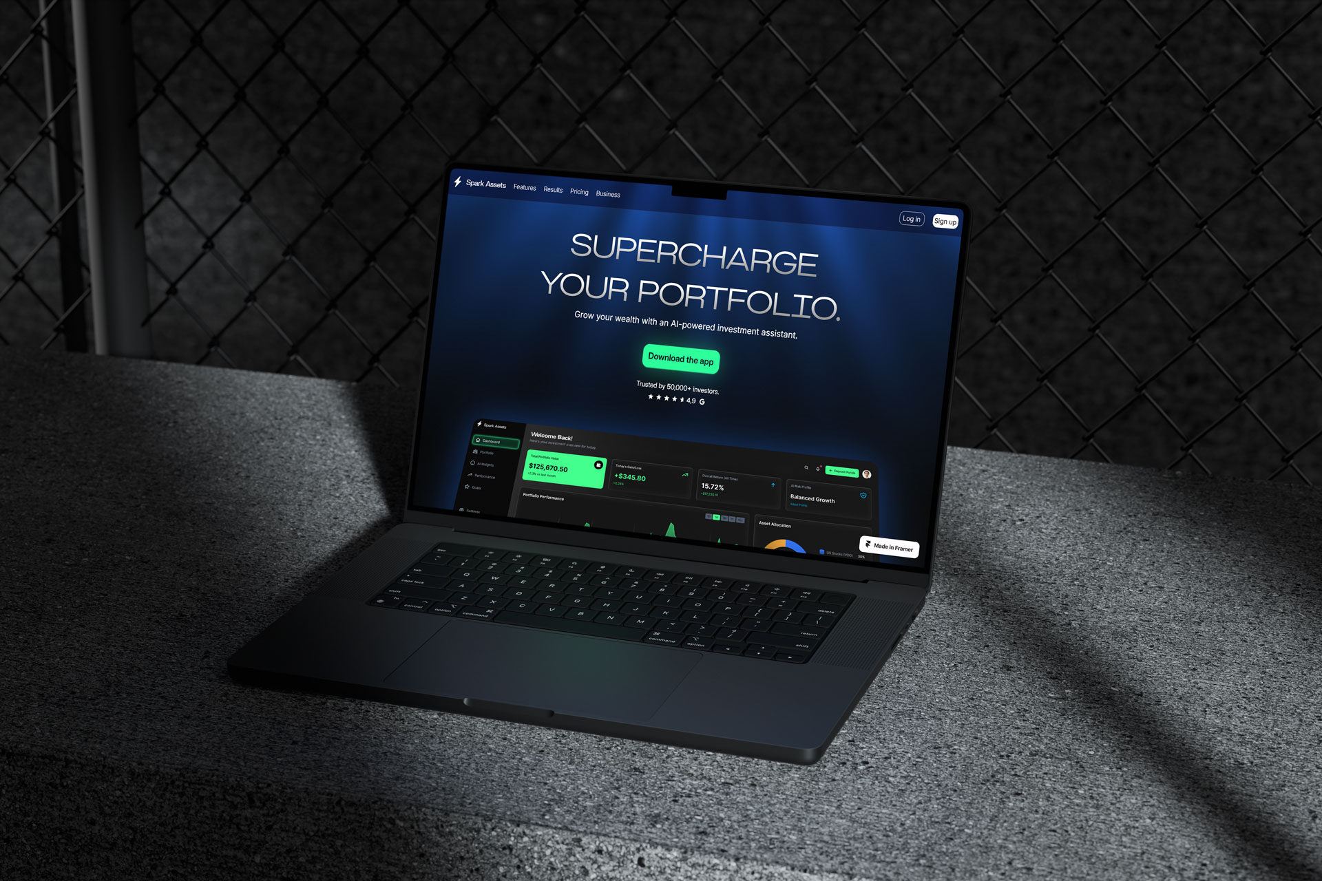
Conceptual landing page design presenting a software investment product in a highly engaging way.

Software used:

Framer, Spline

Created by:

Borys Kapica

Date:

February 2024
Web Design

Introduction

I designed this landing page with the goal of presenting a software investment product in a highly engaging way.

My role as an UI designer involves crafting and launching a complete landing page – from creating components, through setting up animations, all the way to optimizing the page for various devices. The main challenge was creating an engaging and easy to digest scroll experience of a potentially mundane and complicated topic – an investment platform.

Visual Strategy & Identity

Neon Lights

To achieve an ultra modern look, I decided on keeping the site black and highlighting crucial elements with neon-like light effects. This includes elements like the animated “god rays” effects, pulsating glows and gradient coloring.

Typography

For maximum impact, I chose the Britanica Bold font for headlines, using the “Semi Expanded” version in the hero section. For clear yet modern paragraphs, I paired it with Inter.

Color Palette

To give the neon-like effects the necessary contrast to shine, I chose a black background. Primary color for the main buttons and highlights is cold green, while background glows are created with toned-down electric blue. The last color is red, used to indicate lower performance, which is standard practice among investment platforms.

Components

Buttons are equipped with subtle animated glow, while text frames use transparency to let through the background animations.

Final Website Design

Hero section

The main highlight is the tilting scroll animation of an ultra simple website prototype. The background includes an animated god-ray effect. The main CTA is backed up with social proof.

Mobile Prototype

The mobile prototype is presented in another scroll animation.

  • For desktop, I custom made the animation using Spline.
  • The tablet and mobile versions use a simplified, tilting 2D image.

As scrolling continues, the user is presented with 3 highlight features.

The Chart

To visualize the gains, I created an interactive chart with fictional S&P 500 data, embedded as a HTML element in Framer.

Testimonials, FAQ & Final CTA

These sections use semi transparent frames with simple text animations for extra engagement. FAQ section is a simple interactive accordion. After getting all the information, the user is enticed to download the app in the final CTA.

Next steps: Feedback & Testing

  • Getting client feedback – required to check if the design meets the startup’s expectations.
  • Conducting usability testing – required to validate the design’s functionality.

Next steps: Prototype improvements

  • Additional optimization – testing less demanding animations for slower desktops and mobile devices.
  • Adding subpages – necessary for page completion.

Thank you for viewing this project.

Feel free to view my other projects and get in touch!