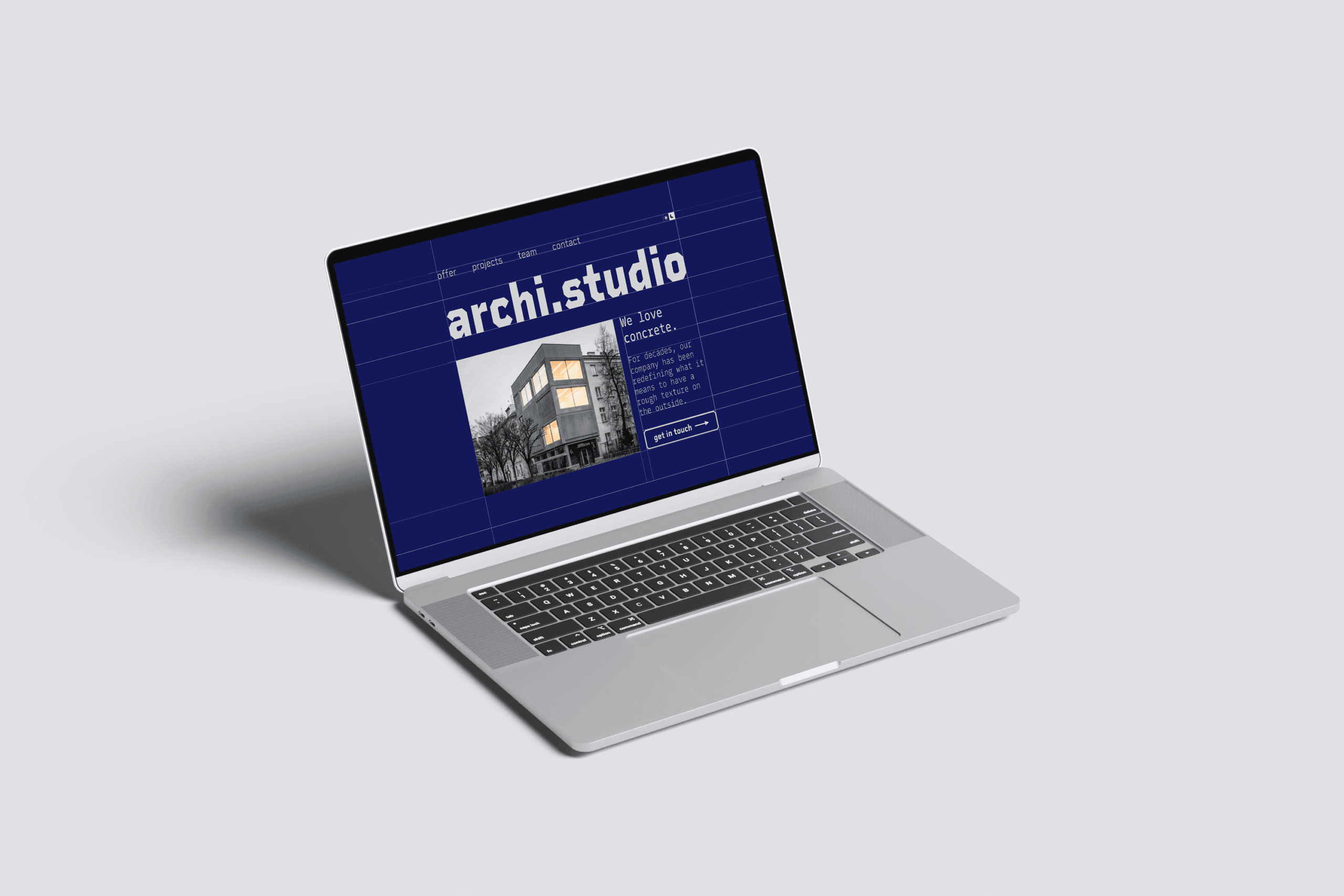
archi.studio – Homepage design for an architecture studio

Home page design presenting a fictional studio as a professional, versatile and experienced team, while conveying their buildings’ brutalist aesthetic.

Software used:

Figma

Created by:

Borys Kapica

Date:

January 2025
Web Design

Introduction

This home page’s purpose is to present the fictional studio as a professional, versatile and experienced team, while conveying their buildings’ brutalist aesthetic.

My role as the UI designer involves translating the studio’s architectural approach – brutalism – into the web design language, while keeping the site’s messaging direct and concise. The main challenge was creating a minimalist design that is both artistic and functional.

The Blueprint

I chose to expose a grid that reveals most of the design’s frames. Not only does it immediately bring to mind an architectural blueprint, but also follows the brutalist approach – exposing the design’s structure to the naked eye.

Typography

I chose Rigid Square font as the primary, ornamental font that reflect’s the grid’s rough edges. For a clearer reading experience, for paragraphs it was paired with Mono Linear.

Color palette

The color palette differs between dark and light mode.

Dark mode is limited to navy and light gray. The interplay of these two colors provides the necessary contrast and consistency over the entire page.

For light mode I decided to go with a limited palette of gray tones to stay in line with the studio’s brutalist aesthetic. Light gray was used for the background and dark gray for most components.


Button components

For the button outlines I created rectangles with corners cut at 45 degrees. This reflects the typography of the Rigid Square font and adds to the overall visual consistency.

Final Website Prototype

Hero section

Includes a large image of the studio’s best design and clearly presents their mission statement.

Offer section

I chose to present the studio’s offer in an unconventional way – by presenting an actual building’s blueprint. By hovering over the “rooms”, the user reveals the studio’s 4 areas of expertise – private housing and offices, as well as public libraries and art venues.

Gallery section

The studio’s image gallery is presented in a bento box style grid, exposing the main text and button in the center.

“Team” section

To convey the studio’s “flat organization” approach – one that does not involve hierarchy – I chose to display the members’ photos in identical tilted squares.

“Get in touch” section

The final section includes a custom Google Maps embed, as well as the necessary contact information and social media buttons.

Next steps: Feedback & Testing

  • Client feedback – required to check if the design meets the studio’s expectations.
  • Usability testing – required to validate the design’s functionality.

Next steps: Prototype improvements

  • Offer section – needs testing against a simplified version.
  • Responsive prototype – required for phones, tablets and wide screens.
  • Subpages – necessary to deliver before proceeding with development.

Thank you for viewing this project.

Feel free to view my other projects and get in touch!